Insights Report
Our Insight report is a new and exciting way to view trends in your call data, whilst also comparing your data to other similar businesses in your selected Category.
Note: A Category is defined on account set up, and can always be updated if required.
All accounts will have access to the Insights report, and all accounts will be able to see their main call statistics compared to other date ranges i.e. month on month, year on year etc
The main section of the report shows three main sections: your account compared to the previous month, your account category compared to the previous month, and how your account compared to the whole category for the selected month.

The comparison data is colour coded to give you quick insight into the trends:
Green - has increased from the previous period
Red - has decreased from the previous period
Your Account

Phone Calls - Total calls received into your business
Not Answered Calls - The percentage of missed calls
Time to Answer - The average time it takes to answer the phone
Call Duration - What is the average call duration
Busiest Time - The busiest time of the day and day of the week for calls
Category
You will then see the same data for the Category your business is in. For this example, this business is in the Home Services - Plumbing category.
The main difference for the Category data, is Phone Calls will show the trend of the category for the comparison period. This is a great way to see how all the other businesses at an aggregate level are performing in your industry within the Category.

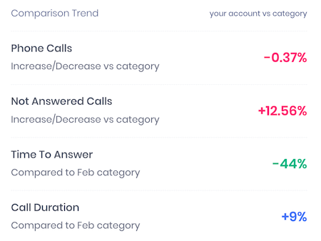
Comparison Trend
To round out the top section, you will be presented with the Comparison Trend, which is your Account data compared to the Category data you are in.
In the example below:

Phone Calls - Your total phone calls is down -0.37%, compared to the average increase/decrease of the Category
Not Answered Calls - Your missed call percentage is 12.56% higher than the Category average (here lies a huge opportunity to improve your call handling)
Time to Answer - Your business answers the phone call 44% quicker than that of the average in the Category 👍
Call Duration - Your average call duration is 9% longer than the Category average (note colour is blue, as this can
Call & Category Trend
In the middle of the page, you will be presented with a month on month chart which plots your call data and the category call data trends. A fantastic snapshot to identify key trends in your Category and if there is any seasonality, or other factors i.e. COVID with significant impacts within your Category and find ways to improve your business. 
Tracking Source and Source/Medium Trends
Finally, at the bottom of the page you are presented with two tables showing you the total calls + the position changes for the selected month.
- Top 5 Tracking Source for selected month:

- Top Source / Medium for selected month:

